Solstice Analytics: Compare
The Compare analytics page in Solstice Cloud allows provides both graphical representations of and source data for usage data for specific options within a defined category. You can select to graph usage data for up to eight options within a category together and compare the same usage data for different defined options within a category.
This page is divided into two main parts:
Category Compare Graph - This is a graph at the top half of the page that displays data by category over a selected time period.
Displays Table - This table can list all the Pods that are being managed in your Solstice Cloud instance, or it can display a filtered subset of Pods. You can change options and apply filters that change the data that appears in the table as well as apply to the data displayed in the table.
Collected Data
Insights from Analytics
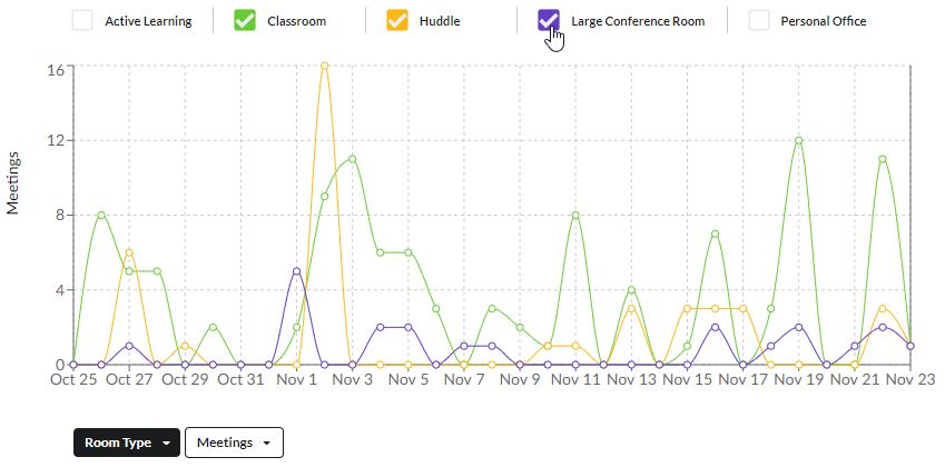
Here is an example of how to generate a graph that can provide insights into how your Pods are being used.
To determine how often meeting spaces that contain Mersive Pods are being used:
Note
This example assumes you have defined a category named Room Type and that you assigned Pods to options in that category. The category name used below is arbitrary; if you have a category that is roughly similar, choose the name of that category in step 4.
In the left sidebar menu of the Solstice Cloud portal, go to Analytics > Compare.
At the top right of the page, select the time period you want the graph: 48 hrs, 7 days, 30 days, or Custom. For information on specifying a custom time frame, see Set a Custom Time Period for Your Graph .
In menu in the top right of the table, select the time increment you want for your graph: Days or Weeks.
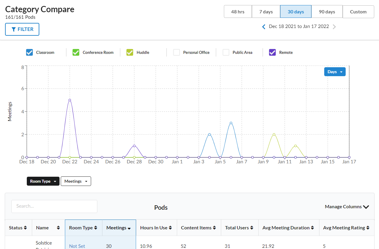
From the category list, which is on the left just below the graph, choose Room Type.
From the compare list, choose Meetings.
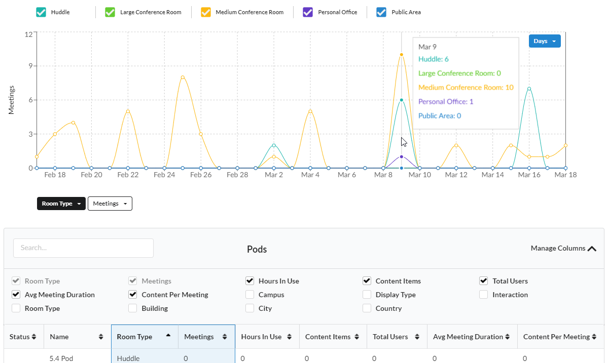
Using the checkboxes above the graph, select the options you want to appear.
Each meeting space is rendered with a different colored line. By mousing over a plot point on the graph, you can display information about all the meetings spaces for that specific time period.
By selecting additional analytic data or categories in the Pods table, you can gain additional insights into the meeting context for each meeting.
How To
Below are the instructions on how to use the controls and filters on the Compare page.
You can change the time increment by which to group your selected Analytics data on the graph—for example, graphing data for the last 48 hours by hourly data points. In this way, you can view the information broken down by smaller time increments or aggregated into larger increments like weeks or months.
In the graph at the top of the Analytics page, locate the menu that contains time increments (usually set to Days by default).
Select the time increment by which you prefer your currently selected data to be graphed, Hours, Days, Weeks, or Months. Time increment options depend on the time period that is selected in the upper right of the Analytics page. For example, if the 48 Hour time period is selected, hours are the only available time increment.
The graph shows your selected data grouped into data points by the selected time increment.
The selected time period on Solstice Cloud Analytics pages applies to all data displayed in graphics and data tables and generally defaults to 30 days. You may choose a different time period from a pre-set list or define a custom time period to view the data associated with it.
In the upper-right corner of the Analytics page, locate the bar of pre-set time periods. The options shown may vary depending on the Analytics category.
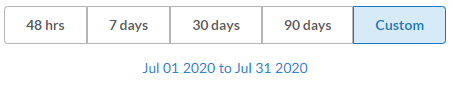
To view data for a custom time period, click the Custom button at the end of the time periods bar.
In the pop-up calendar, navigate to and select the past date when your custom time period should start.
Use the arrows next to the year to navigate to the desired year.
Use the month menu to select the desired month.
When the calendar for your desired year and month you appears, click to select the day you want to the time period to start.
Use the same controls to navigate to and select the date you want your custom time period to end, up to the present day.
The custom date rage is set and appears below the time period selection bar.
In the left menu below the graph, select the category you want to graph.
Select the Pod usage data you want to graph for the selected Pods from the right menu below the graph. This is the vertical axis of the graph.
Above the graph, checkboxes appear that list the available category options that you can display in the graph. Select the boxes for the options you want to compare. The color of the checkbox corresponds to the data line in the graph that shows the Pod usage for that category.
You can mouse over graphed data points to see data details for that time period.
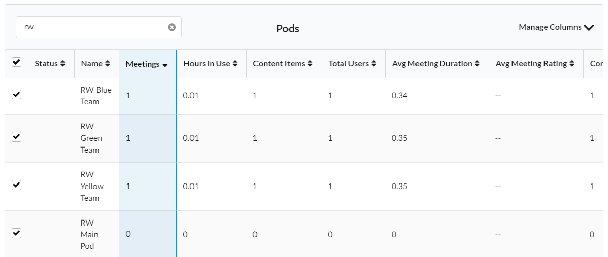
By default, data from all Pods managed in your Solstice Cloud organization are included in analytics graphs. You can change this by managing Pod selections in the Pods table to include or exclude data for specific Pods. Use the Search box to quickly find specific Pods in the table.
Scroll down to the Pods table that appears below the graph on the Analytics page.
Use the checkbox that appears to the left of a Pod's name in the table to deselect that Pod, removing it from the graphed data, or select it to include it in the graph.
To use the Search box to quickly locate specific Pods in the data table, enter a whole or partial Pod attribute that appears in the table, such as a Pod's name. This search shows Pods with data matching the search term in any column. For example, searching for "conference" matches Pod Names that contain "Conference" as well as Pods with a Room Type that contains "Conference Room".
Click Manage Columns and select or deselect Pod data categories to view hidden data or hide unneeded information. See the Manage Columns section below for more information.
Clear a Search filter by clicking the X icon to the right of the entered search term. It also appears as an applied filter to the right of the Filter button at the top of the page and can be removed there.
Quickly locate columns for some categories by selecting them from the menus above the Pods table. Columns for the category or categories selected to appear in the graph at the top of the page also appear highlighted immediately after the Names column in the Pods table.
By default, data from all Pods managed in your Solstice Cloud organization are included in analytics graphs. In addition to manually selecting and deselecting Pods in the data table, you can use the Filter by Category pane to select to view data from only Pods that match certain criteria.
Filter by Category shows all categories available in your Solstice Cloud organization, both Solstice presets and categories that have been manually defined for your Solstice deployment. See more about Creating Categories and Assigning Pods. You may select one or more attributes from any combination of categories to select the data you want to view on the Analytics page.
Click the
 button in the upper left. The Filter by Category pane opens over the right side of the page.
Click the
 icon for each category to reveal the available category options.
Select the options you want to filter for in each category.
Click the
 icon to view the table with the selected filters applied.
Selected filters appear in blue lozenges to the right of the Filter button at the top of the page. To remove a previously set filter, click the
 icon for the filter you want to remove from the displayed data.
Note
The Filter by Category section lists all the categories that have been defined in Solstice Cloud. Clicking on any of the categories displays all the defined options for that category and indicates how many displays have that option set. When you select one or more options under that category, the table shows all Pods that belong to ANY of the selected options.
However, when you make selections in a second category, the table only lists Pods that belong to either option selected in the first category AND either option selected in the second category.
Use the Manage Columns to choose which categories of Solstice Pod data to show in the Pods table on Analytics pages:
Scroll down to the Pods table that appears below the graph on the Analytics page.
Click Manage Columns in the upper right corner of the Pods table. An area below the table title bar appears, displaying a checkbox for each available data option and category defined in your Solstice Cloud account that can be shown on the selected Analytics page.
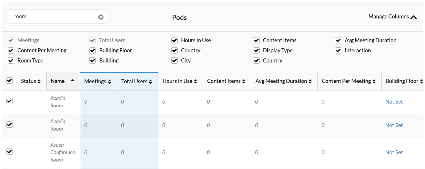
Select the data categories you want to show as columns in the Pods table. Changes immediately appear in the table below.
If a data category you want to hide from the table cannot be unchecked, it may be selected to be displayed in the graph above. Change the selection(s) in the blue and green menus above the table to categories other than ones to hide.
When your desired data categories appear in the Pods table, click Manage Columns again to hide the category list.
Note
Manage Columns options affect only the columns being displayed in the Pods table; they do not affect the data displayed in the graphs above.
You may also click the sort icon
 to the right of a column title to change the sort order of the table. Click a second time to reverse the sort order (ascending/descending) for that column.
Note
Only selected Pods are included in the data that is graphed. However, all Pods currently listed in the Pods table, which can be either checked or unchecked, are included in the CSV file export.
Scroll down to the Pods table that appears below the graph on the Analytics page.
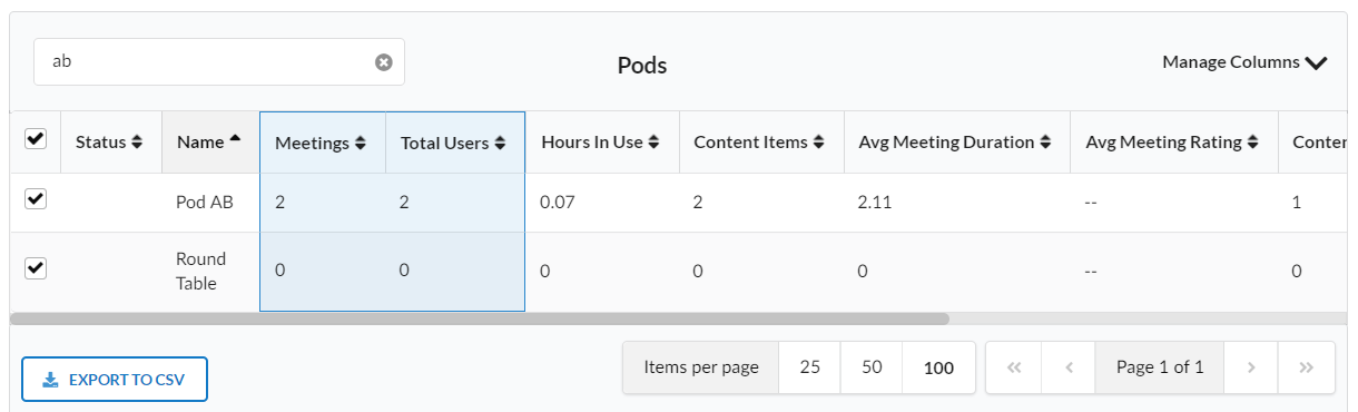
When the Pods table displays all the Pods and associated columns data you want see in your preferred sort order, click Export to CSV. For example, to show all the data for all the Pods being managed by Solstice Cloud:
By the Filter button at the top of the page, remove all previously set filters by clicking the
icon to remove all blue category and search filters.Or you can clear a search filter in the table by clicking the
 icon in the Search box.
Click the Manage Columns selector, and select all the check boxes.
At the bottom of the Pods details table, click Export to CSV.
Your browser downloads the CSV file to its default downloads location or prompts you to choose a location for it, depending on your personal browser settings.