- Solstice Documentation
- Analytics in Solstice Cloud
- Solstice Analytics: User Trends
Solstice Analytics: User Trends
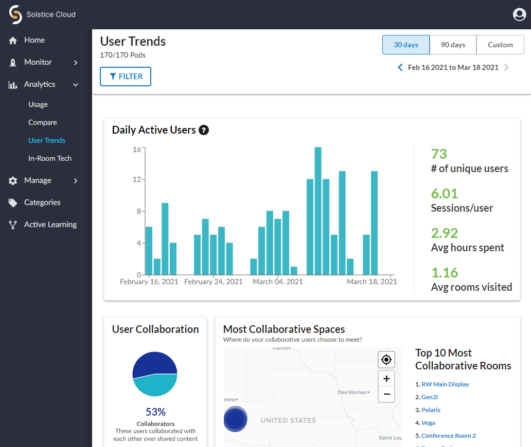
The User Trends Analytics page launched in Solstice Cloud provides insight into how end users of Solstice are engaging with meeting and learning spaces.
User Trends Data
See more details about source data by mousing over data sections in charts and graphs.
User Trends analytics data cards include:
Daily Active Users shows a graph of the number of users who connect to Pods during the selected time period. A summary of the number of unique users connecting to Pods and averages for the time they spent presenting in meetings, number of unique meeting rooms they visited display to the right of the graph.
User Collaboration shows the percentage of users that collaborated in meetings compared with users who were the sole presenter in meetings.
Most Collaborative Spaces shows the location and activity levels of the Pods that are used most for collaboration in your Solstice Cloud organization. Click a Pod's name to view collaboration stats and a collaboration score (based on the number of meetings and collaborators) for that Pod.
User Mobility shows a breakdown of how many different rooms users visited for meetings during the selected time period.
Activity by User Mobility shows how user mobility correlates to their level of meeting engagement.
Collected Data
Solstice data is uploaded to Solstice Cloud on a daily basis. After the data from a Solstice Pod is uploaded to Solstice Cloud, it is deleted from the Pod. Solstice Cloud tracks the following usage data for Solstice Pods.
How To
Use the instructions below to learn how to use the controls and filters on the User Trends page.
The selected time period on Solstice Cloud Analytics pages applies to all data displayed in graphics and data tables and generally defaults to 30 days. You may choose a different time period from a pre-set list or define a custom time period to view the data associated with it.
In the upper-right corner of the Analytics page, locate the bar of pre-set time periods. The options shown may vary depending on the Analytics category.

To view data for a custom time period, click the Custom button at the end of the time periods bar.
In the pop-up calendar, navigate to and select the past date when your custom time period should start.
Use the arrows next to the year to navigate to the desired year.
Use the month menu to select the desired month.
When the calendar for your desired year and month you appears, click to select the day you want to the time period to start.
Use the same controls to navigate to and select the date you want your custom time period to end, up to the present day.
The custom date rage is set and appears below the time period selection bar.
By default, data from all Pods managed in your Solstice Cloud organization are included in the charts and graphs. You can include or exclude the data from a specific Pod or Pods using the Filter by Category pane.
Click the
 button in the upper left. The Filter by Category pane opens over the right side of the page.
Click the
 icon for each category to reveal the available category options.
Select the options you want to filter for in each category.
Click the
 icon to view the table with the selected filters applied.
Selected filters appear in blue lozenges to the right of the Filter button at the top of the page. To remove a previously set filter, click the
 icon for the filter you want to remove from the displayed data.
Note
The Filter by Category section lists all the categories that have been defined in Solstice Cloud. Clicking on any of the categories displays all the defined options for that category and indicates how many displays have that option set. When you select one or more options under that category, the table shows all Pods that belong to ANY of the selected options.
However, when you make selections in a second category, the table only lists Pods that belong to either option selected in the first category AND either option selected in the second category.
