Usage Analytics Tab
On the Analytics page, the usage tab displays metrics that are calculated every night from the raw events data for each organization, and the charts will display the data up to yesterday’s date.
There is a time frame selector with five options: last 7 days, 30 days, 60 days, 90 days, and All time. By default, the last seven days are selected, and users can change it to other time frames. When the user changes the time frame, all visuals on the page should update to include the data in that time frame.
Device Utilization
This section contains a dual-axis line chart that lets users select up to two of the five metrics.
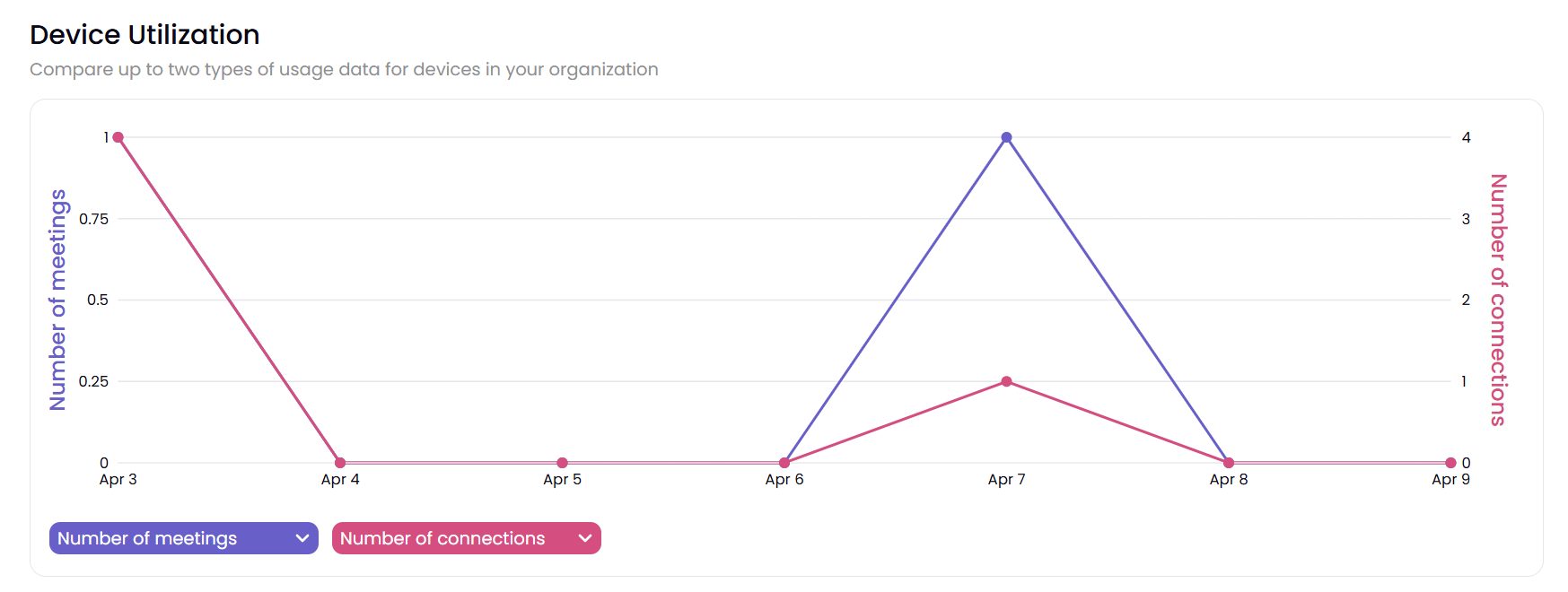
Number of meetings: The number of meetings lasting over five minutes.
Hours in use: Total number of hours used for meetings lasting more than five minutes.
Number of connections: The total number of individual connections made to any pod.
Number of posts: The total number of content items that were shared.
Average length of meetings: Hours in use divided by the number of meetings.
User Connections
This section is a single-axis area chart that breaks down the number of connections metric by various segments.
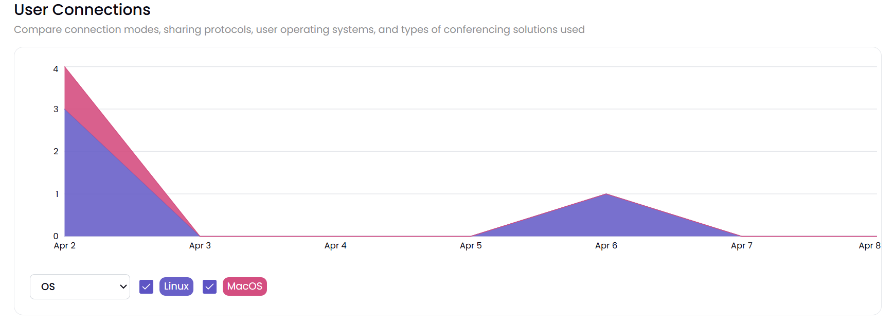
Number of connections: This shows the number of connections by day, broken down by the operating system from which each connection was made. The sum of these should equal the metrics in the Device Utilization chart above. Users can uncheck specific segments on the chart to filter/unfilter segments
Collaboration Usage
This section is a single-axis line chart that has two metric lines.
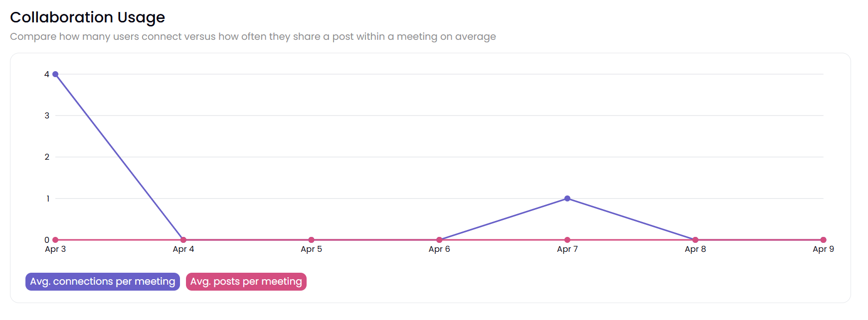
Average connections per meeting: This is defined as the number of connections divided by the number of meetings by day.
Average posts per meeting: The number of posts divided by the number of meetings per day.
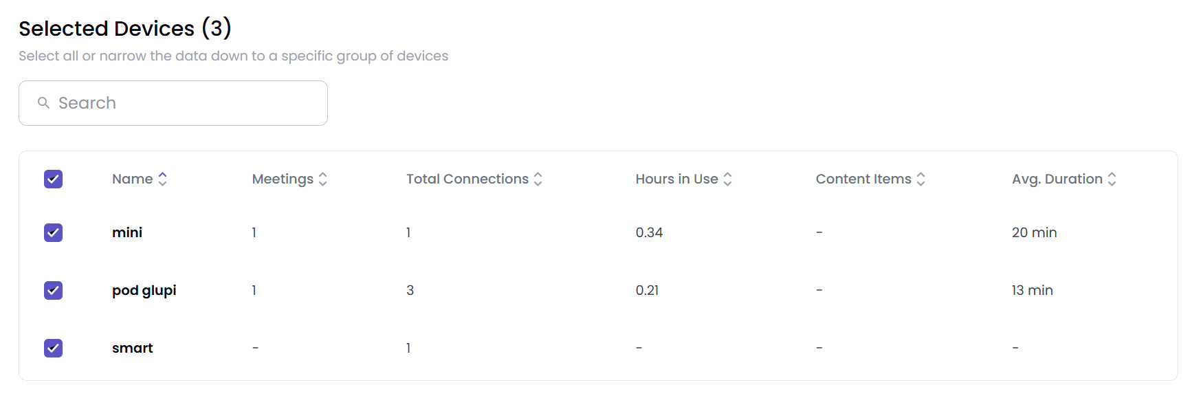
Selected Devices
This table summarizes the number of meetings, hours in use, connections, posts, and average meeting duration at the device level. Users checking and unchecking each device act as filters to include/exclude data from all the charts above this data table.
Note
This page has an “Export to CSV” button that exports the data in the tabular visual in the Selected Devices section into a CSV file. If there’s no data to export, then this button will be disabled.